Tomorrow, Saturday February 1st 2014, the
University of Kent Keeley
Saunders , Frances
Greenaway has been vocal on the subject of cinema’s
limitations for many years, most overtly in his insistence that cinema has
never developed into its own visual
medium, and that it’s reliance upon the written word (in the form of
screenplays) makes it a slave to the earlier traditions of literature and the
theatre. He believes that cinema, in order to free itself from the constraints
of text, should become an entirely audiovisual medium, closer to a moving
painting than a performed story. Despite this attitude, Greenaway himself has
produced little work in this vein, instead choosing to produce work that critiques existing cinematic conventions
rather than providing alternative ones.
Not to say that he has produced nothing that moves beyond the parameters of standard film; there is
the multi-screen VJ performances of The
Tulse Luper Suitcases, where he edits the film ‘live’ on stage, or the
installation work Peopling The Palaces,
that projects film on to all of the walls and even ceiling of a particular
venue, providing an immersive cinematic experience, or his projection of light
onto Rembrandt’s The Night Watch in
order to make the painting appear to move and transform. But his most well
known works (The Cook, The Thief, His
Wife & Her Lover, The Pillow Book,
Drowning By Numbers or Nightwatching) are feature-length
narrative films that began life as screenplays. These films often provide
alternative ways of presenting story information other than through traditional
narrative; Drowning By Numbers is
structured numerically, with the numbers 1-100 littered through the film
counting down to the conclusion, Cook/Thief/Wife/Lover
structures its characters and events around the conceit of Newtonian colour
theory, with each set designed around a different colour and its apparent
associated meanings. But most frequently, Greenaway’s favourite alternative
structure to narrative is that of lists and categories.
M Is For Man, Music
And Mozart is a 30 minute short film (part of the series Not Mozart where famous directors and
composers deconstruct the works of Mozart) that demonstrates Greenaway’s
obsession with the cinematic image, its relationship to text and theatre, its
potential to replicate painting and become a chapter in the history of Visual
Arts, and the use of categories, lists and associations as alternative devices
to narrative. Ostensibly, the film is a meditation on Mozart and his music
through a series of short segments, each building upon the last and providing a
slightly different structuring device. It opens with a list of words, written
and sung in largely alphabetical order, presenting a variety of concepts
related to man, his body (B is for bile, blood and bones) and beliefs (A is for
Adam, E is for Eve). As these words appear across the screen, two female dancers
(who might be muses, fates, furies, or stage-hands) communicate the ideas
through their bodily movements in a blacked-out space, filled in by sketches
and words superimposed on screen.


Once the alphabet has reached the middle letter, ‘M’, an
allegorical tale begins, showing the gods creating man. The gods, a shifty
looking crowd of corpse-white individuals wearing rags and holding various
signs marked with single words, proceed to try and make a ‘man’, going through
various possible source materials. Now the film utilises a ‘theme and
variation’ structure: a Man of Letters is a human outline created from the
gods’ signs, a Man of Meat is cobbled together from a butcher’s wares, a Man of
Metal is comprised of various utensils, and so on. These proto-men are
Acrimbaldo-like figures, simultaneously a human-like entity and a collection of
objects.


Eventually, Man as we know him is finished and a new
sequence begins where the gods teach man movement. An extended dance sequence functions
as a demonstration, as Man slowly at first moves his arms and legs, eventually
getting up and dancing about the auditorium where the action takes place. In
the next sequence, the gods teach Man music, and another dance sequence sees
the two maybe-muses manipulate Man like a mannequin, moving him in rhythmic
actions and placing various instruments in his hands. Finally, having created
man and music, the gods find it necessary to create Mozart and another sequence
mirroring the first sees Man in a blacked-out space embellished with hand-drawn
sketches and notes.


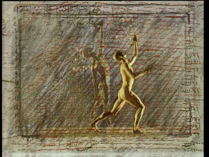


But Greenaway twists this relationship in order to give visuals the upper-hand. Long fascinated with calligraphy, the art of penmanship where the craft is in the very specific visual flourishes of letters, Greenaway transforms text into images, the words do not overcrowd or block out the visual composition, but instead become a part of it. Though there remain layers and layers of complex word-games and associations going on within the words on screen, our attention instead is pulled towards the visual qualities of the words, their aesthetic worth within the overall framed composition.

M is not only the first letter in Mozart’s name, it is also
a symmetrical letter, sitting in the centre of the frame (as it sits in the
centre of the alphabet), it calls attention to and aids the balance of the
composition, further emphasised through the similarity of the two muses/stage-hands
that cavort throughout the film. Likewise, the scroll of writing that runs
along the top of the screen, like a news report, simply reiterates words that
have been sung earlier. These words are included because of how they look and
what they add to the film’s visuals rather than as communication of new
information.
As stated above, we can find these sorts of text-image
relationships in an earlier tradition, that of the illuminated manuscript. One
can find a plethora of illuminated books from the 13th century onwards that
augment the written words of the Bible with ornate images that do more that
simply illustrate the story, but I wish to focus on two much later examples.
William Blake, famous for providing illustrations to the Bible, Milton


Linking in with the previous month’s post on Wunderkammer’s,
the illuminated work The Model Book Of
Calligraphy belonged to the eccentric Emperor Rudolph II. Initially a book
consisting entirely of calligraphy by Georg Bocksay, Rudolph II commissioned
artist Joris Hoefnagel to provide paintings to accentuate the visual beauty of
the words. Hoefnagel not only provided images that related to the words already
on the page but also composed them in such a way as to create apparent spatial
relationships between word and image. The text, originally laying flat on the
page, now seems to float in the air, hovering above the flora and fauna that
appear grounded on an ambiguous surface. New images, depicting specific
objects, transform the nature of the images of text. Not simply illustration,
where the images are limited to the content and meaning of the words, but a
visual response to the text,
Hoefnagel’s illuminations prefigure Greenaway in their combination of text and
image in service of aesthetic rather
than informative purposes. These images have been taken from three volumes
published Thames & Hudson, annotated by Lee Hendrix and Thea
Vignau-Wilberg. Unfortunately, there are few images available online and so
these are photos of the books taken by my own fair hand – hence the slightly
poor quality.


The latter portion of the same book allows Hoefnagel to take
this even further, producing an ‘Abecedarium’, an artistic guide to the letters
of the alphabet. Here, the letters form the central focus of each image, but
they are also the foundation of a visual work, it is their artistic qualities
that are emphasised. Both the ‘majuscules’ (capitals) and ‘miniscules’
(lower-case) are presented to us in glorious elaboration, the symmetrical
composition and rich detail of the depicted objects again creating a sense that
we are seeing a three-dimensional construct in space rather than a flat image
on a page.


This is the same effect that Greenaway achieves, though through the exact opposite means. While Hoefnagel takes the flattened words and letters of text and places them within a fictional space through the application of artistic depictions, Greenaway takes the actual space of the pro-filmic action – the auditorium and space where the figures move, create and dance – and uses overlaid text to flatten the images on screen. The images and text are united in a conceptual middle-ground; in Hoefnagel’s work, they do not meet on the page but the space depicted within it, and in Greenaway’s film the diegetic space of the action seems to collapse into the non-diegetic superimposed text to create a composition that exists on the screen. In both cases different artistic media have been merged in the creation of something new.
- P.S.